Web 2.0

16 04 2009

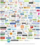
web-20-1When I try to explain what it is I do for people/businesses who want a new web presence, the term “Web 2.0” inevitably comes up. So what is “Web 2.0”  Consider Web 1.0 to have been the original incarnation of the World Wide Web. In this model, companies were very proprietary, and everything was held apart. For each site you might want to use, you would have a different user name and password, and there was no connectivity between the two. In the old WWW, content was modifiable only by the owner, and not often. Websites were more static pages announceing a presence. After the dot com bubble burst, more and more companies moved to a new model (elements of it had existed prior). In Web 2.o, the two biggest aspects are: INTERCONNECTIVITY and INTERACTIVITY.

Interconnectivity means that many usernames became portable– i.e. I can sign in to my wordpress account and then be automatically signed in to my platial account. Now you can update content one one site from another– for example, when I update my twitter status (either on their www page or via my cell phone), it is linked to my facebook status, which then automatically updates. This is the period of “widgets,” where you can bring everything together. On your blog, you can have widgets for your bookmarks, photos, maps, etc. The danger with this becomes overexposure, but in time, I believe the programs that really work will surive and the others will fall to the wayside.

Interactivity means that the website is no longer a static thing controlled by one person or entity. In Web 2.0, feedback is always welcome, communication is key, and file sharing is ever present. Flickr is an example of a site that uses Web 2.0. Users can not only upload photos, they can share them with friends, with users with similar interests, with groups. They can also comment on other users photos, and add users as “friends” for easy access. All of the social networking sites use Web 2.o, but it is becoming more and more important on the individual/business website. If you want to survive in this changing World Wide Web, you want to think about adding INTERCONNETIVITY and INTERACTIVITY to your site. Give your readers a stake in what goes on, and they will keep coming back.

For more information, check out this Web 2.0 Reference Guide from  Radford University Technology in Learning


Updates

23 02 2009

igscreencap

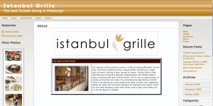
I have been very busy with the webpage/customized blog aspect of PPC. Check out these new and/or revisioned websites that PPC is directly involved with:


Web Design Sample

4 10 2008

Here is a screen cap from a portion of a website I designed for diabetes research funding.


Using Color Effectively

25 09 2008
Themes should be customized to put the reader in the mindset most conducive to recieve your message.

Themes should be customized to put the reader in the mindset most conducive to recieving your message.

The principles of color for print works are not always transferable to works viewed primarily on the computer. When making PowerPoint presentations, webpages, or other projects to be viewed on a computer or projection screen, there are certain considerations to keep in mind.

1. Eye Comfort

Some colors are more or less straining on the eyes than others. The most comfortable color viewed on a computer screen is blue. White text is easily read on a blue background. Colors that are distracting or uncomfortable to view include blue on black and red on green or green on red. Bright neon or florescent colors should generally be avoided, though they can sometimes be used for effect.

2. Readibility

The text should always be legible against the background. Again, some color combinations should be avoided to ensure the text can be read. Yellow on white, blue on black, and colors that are very similar in hue and shade should be avoided. Black on white and white on black always provides sufficient contrast.

3. Symbolism

Whether or not we consciously realize it, certain colors have a tendency to affect us in certain ways. For example, yellow is a color that stimulates the intellect. This is why many school classrooms are painted yellow. Blues and greens are a more calm and peaceful color, but many shades of them should not be used in conjunction with food product placement, as they are also appetite suppressants. Red is a powerful color, and orange is a warm energizing color.

4. Relevance

Color should complement the content of your project, and not detract from it. Follow a theme, such as using earth tones (browns, greens) for an eco-friendly project. Purples appeal to children. To enforce a hi-tech feel, using silvers, greys, and black is effective. Think about how you want people to feel that will make them most receptive to your particular message or product. Again, greens and blues are not always the best for food, especially the lighter shades. Golds are good for credibility, and are often good when selling a product, especially to men.

The main difference between choosing colors for print vs screen projects is that printed projects will be transposed on top of a white background of the paper. This changes the way the eye perceives the colors, and makes readibility vary from paper to screen. Many of the ideas still apply, but if you are making something for print, don’t just choose based on what you see on the screen. Make sure you print samples for yourself, and if it looks wrong to you, chance are you need to make some changes and print again.

Additional Resources:

How to Choose the Right Colors in PowerPoint: http://www.computorcompanion.com/LPMArticle.asp?ID=262

The Meaning of Colour in Web Design: http://www.sibagraphics.com/colour.php

Color Matters: http://www.colormatters.com/color_trademark.html

Choose the Right Colors for your PowerPoint Presentation: http://office.microsoft.com/en-us/powerpoint/HA010120721033.aspx


Blogs Vs. Traditional Websites for Small Business Owners

19 09 2008
using your computer to maximize your www presence

using your computer to maximize your www presence

If you are a small business owner and are thinking of starting or revamping a website, you have a choice to make. These days, many small businesses, including restaurants, cafes, and more, are turning to blogs over the traditional website format. Why is this, and is it the right choice for you? If you plan on having a pretty static site, with just the basic information (e.g. contact info, directions, menu, etc.), then a traditional website should work fine for you. However, blogging is a way to interact more with the consumer, and this is very ammenable to marketing. Blogging does not require any programming language to still get a great looking page. Customizable templates are the norm. A big advantage or WordPress over Blogger for business sites is the Pages feature, which allows you to still divide up the site into easily accessible and manageable sections. Another advantage to blogs over html websites, is that they use the web standards in css or php, which are highly organized and thus quick loading languages. Finally, blogs offer a way to get more feedback and engage the consumers directly. You can integrate your other tech tools such as web bookmarks, photo streams, and polls, which we will talk more about later.


World of PigeonPeanutConsulting

7 09 2008

Welcome to PigeonPeanutConsulting, a consulting service that is customized for every client! We can work together. Please discover more about us by following the page links at top. Thanks for stopping by,

S.E.A. (PPC)